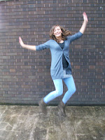
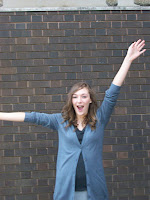
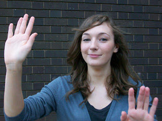
I then uploaded the photos onto a computer in the classroom, then decided which one I wanted for my cover and started to edit it on photoshop. The photo that I decided to use for my cover was the one below of Becca looking like she was doing a mime, you wouldn't look at it and automatically think 'drama' but if the cover gave it all away you wouldnt want to read more. I also chose it because the specifcation was that we had to have a mid shot of somebody for our front cover and this was one of the only mid shots I got, I decided to use one of the pictures of Becca jumping for my contents page.
I started by cutting around Becca using the lasso tool, which took about a billion years because the computers in there are very slow. I wasn't pleased with my final cut out of Becca because it looked a bit sketchy and a bit of her head was missing where I'd gone wrong, which I wasn't really pleased with because nobody wants to buy a magazine with the model on the front who has a bit of her head missing. Then Mr Smith showed me the magnetic lasso tool which was a lot easier because it found the outline of Becca and it made it look a lot smoother.
 I then had to choose my font for the title. I chose a font that I cant remember the name of but it looks a lot like this one, because it is dramatic and that is the theme of the magazine. The colour palette I chose of the text for the cover was the same blue of the cardigan Becca was wearing. I thought it was important to chose the same blue as it made the magazine cover have a theme, rather than me chosing three different colours as well as becca being in blue, it could have looked a bit messy and not actually thought into that much, white ( as i'd given the cover a black background ) and a bright peach colour. I achieved the same blue as Becca's cardigan by Mr Smith showing me how to use the pipette tool on photoshop. I used contrasting colours ( white on the black, blue with peach, white with peach) next to each other so it would be easier for the reader to see what I wanted to stand out. I found it easy working out how to use the layers and how to move things around so that sped things up a bit, I had some basic idea on how to use photoshop from doing art at gcse, but that was more editing photos and scanning things in so not really the same sort of area, I think i did okay for a first attempt at making a magazine cover though :)


No comments:
Post a Comment