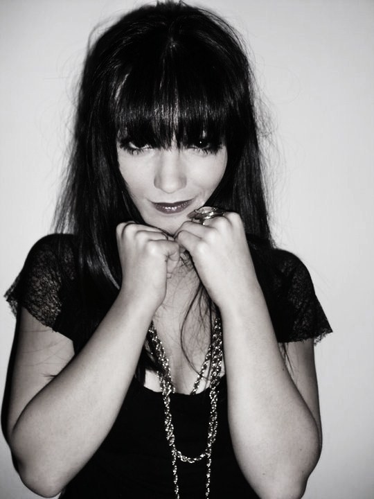
I will replace the images of me with others of different models, but as I haven't taken them yet I put the pictures of me in to give a rough idea on how my contents will look. I also am aware prior to giving in my final copy I need to exactly allign all the boxes, images and text.
Showing posts with label magazine - production. Show all posts
Sunday, 6 March 2011
Draft Contents #2
Draft cover #2
My second draft cover, my only worry would be if it doesn't match the contents and double page spreads.
Draft Double Page Spread #2
I have decided to do two double page spreads taking strong influence from the March 2009 issue of Elle magazine.
Draft Double Page Spread #2
Tuesday, 1 March 2011
Draft Evaluation
After my conversation with Mr Smith I have decided to radically change my magazine in several ways.
I am going to take strong inspiration from the March 2009 issue of Elle.
By doing this I am going to change my colour pallette, to predominantly black and white; with a rasberry red on the cover to make 'Sara' stand out more. I decided to change the word 'pop revolution' to 'pop sensation' as I feel this suits the images and personality I am trying to portray coming from Sara.
I will still use the 'messy' writing on the background on the cover as we agreed that worked well, but have it in a grey rather than the darker purple so the 'Sara' is more obvious and stands out more and draws more emphasis to the image of Sara on the cover.
On the contents and double page spread I will try and keep my colour scheme monochromatic with small hints of the red used on the cover,as I have strong influences from black and white images.
I also will make sure that Sara's make-up blends in with the rest of her body, as it took a lot of effort to edit her face to be the right colour,she looked very washed out.
In conclusion to the images of Sara looking too washed out I have decided to retake the photos of her for my magazine, as now I am certain of what I am doing I can be sure to make them look more professional.
I am going to take strong inspiration from the March 2009 issue of Elle.
By doing this I am going to change my colour pallette, to predominantly black and white; with a rasberry red on the cover to make 'Sara' stand out more. I decided to change the word 'pop revolution' to 'pop sensation' as I feel this suits the images and personality I am trying to portray coming from Sara.
I will still use the 'messy' writing on the background on the cover as we agreed that worked well, but have it in a grey rather than the darker purple so the 'Sara' is more obvious and stands out more and draws more emphasis to the image of Sara on the cover.
On the contents and double page spread I will try and keep my colour scheme monochromatic with small hints of the red used on the cover,as I have strong influences from black and white images.
I also will make sure that Sara's make-up blends in with the rest of her body, as it took a lot of effort to edit her face to be the right colour,she looked very washed out.
In conclusion to the images of Sara looking too washed out I have decided to retake the photos of her for my magazine, as now I am certain of what I am doing I can be sure to make them look more professional.
Tuesday, 15 February 2011
Thursday, 10 February 2011
Friday, 4 February 2011
Sunday, 30 January 2011
Double Page Spread Mockup
Saturday, 29 January 2011
Contents Mockup #2
Thursday, 27 January 2011
Contents Mockup #1
Friday, 21 January 2011
Wednesday, 19 January 2011
Subscribe to:
Posts (Atom)