Friday 25 March 2011

Evaluation question 5: How did you attract/address your audience?


To attract my audience I used a bright colour and a classy layout on my cover, i attract the musical audience I listed popular popstars on the background to indicate that it is a music magazine. I chose these band names as I thought it would appeal to my target audience as ideally that is the kind of music they will be into - this would be a  selling point. I styled my model in a way I would expect my target audience to dress and how they would style their hair and makeup when dressing up. I used the simple colour pallete to not make my magazine look over crowded or busy so this would attract the eye on the newstand. I didn't use any cover lines other than 'Sara - Pop sensation' as she was the main cover artist so I would want the audience to predominantly be interested in her. Overall I think the cover represents and attracts my target audience.

Thursday 24 March 2011

Evaluation question 3: What kind of media institution might distribute your media product and why?

I have decide to use IPC media as they are one of the largest distributors in the U.K. This will give my magazine maximum circulation in order to get the popularity it needs to be as popular as Q and NME magazines.
IPC Media (formerly International Publishing Corporation), a wholly owned subsidiary of Time Inc. It is a consumer magazine and digital publisher in the United Kingdom, with a large portfolio selling over 350 million copies each year. 
By going with this publisher it wouldnt be risk worthy due to their popularity therefore risk of losing potential customers is lowered.

Evaluation question 7: Looking back at your preliminary task (the school magazine task), what do you feel you have learnt in the progression from it to full product?


By comparing these two covers I have obviously improved at designing and producing a front cover. If we focus firstly on the preliminary cover there are many faults that would not get a very good grade if I had submitted that as my final piece. I have not adressed capitals and lower case, I have not alligned any of the text or thought about its position on the page. I have not cut out Becca accuratley as I can still see a bit of the brick wall that was originally behind her. I also had taken roughly ten shots of Becca so there was no way I had enough choice to chose an appropriate front cover picture for my prelim. I had also not thought about the mise en scene and not chosen appropriate clothes for Becca to wear, also due to poor planning I had not chose a colour scheme so I just went with what matched with Becca's jumper on the day! Basically my overall thoughts looking back on my prelim are that it looks like it could have been done on paint.
If we look at my current front cover it is evident a lot of thought has gone into the layout, colour scheme, masthead, mise on scene, camera angle and feature artist. I have alligned the image and text of Sara directly to the middle to make it as aesthetically pleasing as possible. I also edited the picture to make it look as professional as possible. I also used fonts that aren't deafault on most computers so that it would look more original. Also indicating that this is a music magazine by writing famous popstars names in the background.
(I'm aware I need to go into more detail with my contents as well as both my covers)

Evaluation question 6; What have you learnt about technologies from the process of constructing this product?

(I need to take my own images of the technologies used in the process of making my magazine)

My personal laptop; Sony Vaio
This was the most crucial piece of equipment I used throughout the process of making my magazine, as it allowed me internet access and I have photoshop.

Adobe Photshop CS5
This software allowed me to edit my photos, and create my magazine to a standard I was happy with.

School Computer
This computer allowed me to do most of my research and planning during lessontime at school, yet it let me down when it came to photoshop as it was unbarabley slow. I was able to email home images that I took in school but not able to edit them on photoshop as fonts were limited and computer froze every few minuets.

My compact camera
I used this to take the pictures for my contents page, as I didn't need as in depth detailled shots like the ones I needed for my cover and double page spreads. I found that these photos were still good quality and I could zoom until I got the right kind of shot and the flash was powerful so it made my photos look more professional.

My SLR camera
I used this to take the shots of my cover and double page spread shots as I needed more detailled shots as they were going to be at the full length of a page. The flash was very powerful and the zoom allowed me to zoom and keep most of the detail without it being pixelated, I also found this easier when it came to editing the pictures.

Facebook
I used this to get pictures of people for my target audience and speak to my friends to arrange when to meet up to take photos and for advice/feedback on my research/planning and various drafts of my magazine.

Blogger
I evidently used blogger for all of my work, to let my teachers know im up to date with certain pieces of work. It also allowed my peers to look at my work and give feedback.

Evaluation question 4: Who would be the audience for your media product?

I have decided to chose a representative person who is an 'ideal' member of my target audience.
This is Lorna Miller, she is an 18 year old student in her second year of A-Levels at Lutterworth College. She is studying Drama, Textiles and English Literature. Her aspiration for the future is to go to London College of fashion and study Fashion Design, she is also very interested in music and tries to go to as many gigs as possible - when she can afford it. Her interest in fashion is what encourages her to carry on at school, she reads Elle, Vogue, I.D and many other fashion magazines to make sure she is on trend, she also reads Billboard, Q, and YRB magazine. She is an avid listener the the UKtop 40 and constantly listens to Rihanna, Adele, Katy Perry, Kanye West, Fergie, Tinie Tempah, Arctic Monkeys, Cheryl Cole, Take That, Eminem - a variety of different genre's but predominantly top 40 music. Lorna is very interested in going to festivals, as last year she attended Glastonbury and Summer Sundae and this year she is going back to Glastonbury and V festival; 'I was so excited when the line-up for V was released - I love anything that's been in the charts!' She loves the atmosphere and finds it a vital part of appreciating music.
When Lorna goes out with her friends she goes to popular clubs in the centre of town which again, play contemporary music 'I just love music that you can get up and dance to, something thats upbeat and everyone can sing along to' , she is lively and enthusiastic about thins she has a passion for.
Lorna gets most of her fashion inspiration from popstars such as Pixie Lott and Ellie Goulding as she doesn't feel as daring enough to copy the style of Rihanna or Nicki Minaj as it wouldn't suit her personality. Lorna shops in shops such as Topshop, Cult, Urban Outfitters, H&M, Miss Selfridge and Asos. She regularly checks in store or their websites to check up on the latest trends. These are the types of shops I would expect someone in my target audience to go to, she reflects the style of Sienna Miller and Fern Cotton which are also people I would like to reflect in my magazine as they are stylish and contemporary.

I think that Lorna is a very good representation of my target audience as she is young, into contemporary fashion and music and takes pride in her appearance. She also reads music magazines not dissimilar to mine, which shows my magazine is of her taste.

Evaluation question 2. How does your media product represent particular social groups?

Tuesday 22 March 2011

Evaluation question 1. In what ways does your media product use, develop or challenge forms and conventions of real media products?

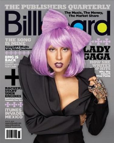
Generically music magazine titles reflect the genre of the magazine in question, such as Kerrang sounds like the sound of a guitar (onomatopoeia) or Billboard magazine; which would imply that the magazine is contemporary and popular - similar to the adverts on a Billboard.
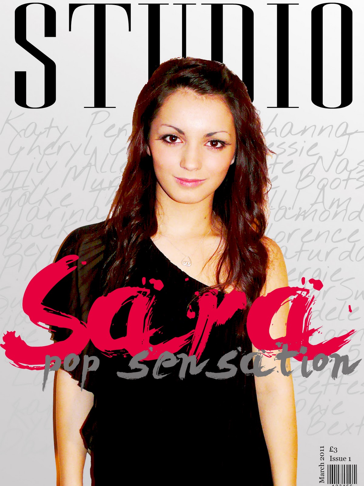
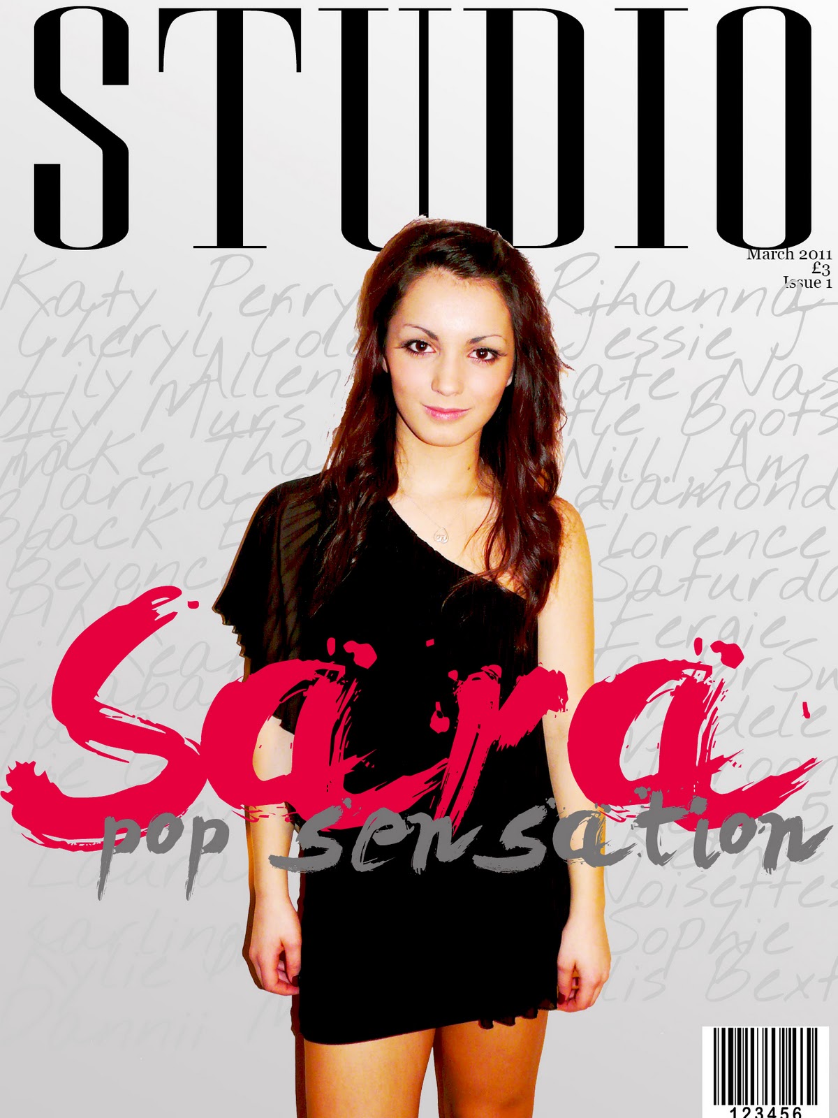
The magazine title I chose was 'Studio' as I felt that it was appropriate to my chosen gender (pop) as pop music is predominantly recorded in a studio.
For evaluating purposes I have decided to focus on the layout of Billboard magazine (as it is another pop magazine i see this to be appropriate to evaluate). After looking at several covers for this magazine I have noticed that
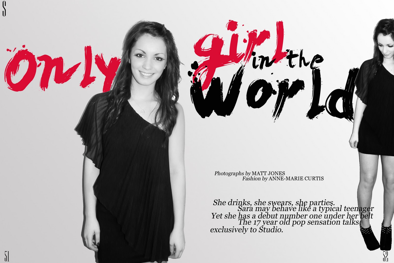
the model is central yet doesn't quite reach the top of the page, I kept this in mind for my magazine as it was the first edition I didn't want the model covering the masthead. Also taking inspiration from this cover I liked the idea of the text going behind the model rather than over it, I think this worked well on my cover as I didn't have any specific coverlines, just lots of artists names which implied it was a music magazine.
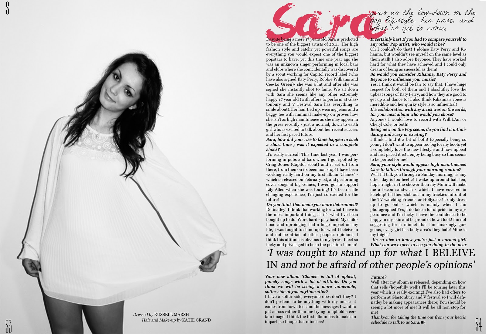
Usually pop artists are associated with wearing high fashion, stylish, possibly cutting edge clothes. I had to keep this in mind when chosing what to dress my model in on the cover, as I don't have access to designer clothes I dressed Sara in a black party dress, which I think looked simple enough to look classy and not distracting from the writing on my cover. I didn't feel it nessicary to use props in my photoshoot as shoots of popstars aren't dissimilar to fashion shoots, I also think this added to the simplicity of my magazine and didn't make it look too 'busy' which can be distracting. I think that my pictures alone wouldn't be easliy related to pop music yet the writing in my magazine denotes that, whereas in pop magazines the artist is usually connected to pop music without having to read the magazine; I didn't have a popstar to put on the cover so I couldn't use that to my advantage.
I found that after looking at several magazines of different genre's that pop music photos are simple, usually using midshots or full length shots rather than experimenting with different angles like rock or r&b might use. I used face on angles and a slightly high angle in my photo's as I didn't want to over complicate things. I think that this looked effective and mimiced what is used in published pop magazines.
I chose the title 'Studio' after mind mapping different names for any music magazine. I decided to use this as it is a single word therefore more memorable like Billboard, Complex and Q. The masthead font is similar to that of Elle magazine, as in my research and planning I stated that I was heavily influenced by fashion so I felt that by taking inspiration from Elle would be appropriate and would give the magazine the style I wanted it to have. The font of the article that I used was 'Georgia' as I found that that was similar to the one in Elle magazine and was simple and easy to read, it also looks classy and again; simplistic so it didn't over-complicate the look of my magazine. I also boxed the paragraphs as I think it looks neater and this is also used in professional magazines such as Billboard.
The style of the magazine I have gone for is a mix of Elle and Billboard magazine, after having my first set of feedback I decided to change the colour  scheme from purple, yellow black and white to black, white and a pinky shade of red. I did this because I think it made my magazine more eye-catching and appealing to look at, I also think it made it look fresher. The only issue I have with my overall style is the issue of my front cover not exactly matching the contents page, yet I think the double page spread's tie them together nicely. I also have put an 'S' in the corner of each page in the masthead font to tie the magazine together more.
The genre of pop music magazines is reflected by the artist on the front and the cover lines. For example, this cover of Miley Cyrus is focussed around her, and the cover lines a lot smaller - to draw more attention to the feature artist. The image of Miley Cyrus with the coverlines would tell the reader that it is a music magazine, and that it is more than likely from the pop genre. I took this into account whilst doing my cover and made 'Sara' the biggest piece of text on my cover in a different colour so it would stand out more and indicate that she is my feature artist.  The contents page of Billboard has a lot of information on it, and it is all organised neatly around the text. I tried to mimic this and the contents page of Elle to reach a happy medium of the two. A criticism of my contents page would be that it doesn't have a specific colour (bar black and white) that runs through the page. Like Billboard, I used images of my artist on my contents page to keep the feature artist running throughout my magazine. On my first double page spread I used the lyrics 'Only Girl in the World' which is the title from Rihanna's recent song, I think this has kept the 'pop' theme in my magazine so that it didn't come become too heavily fashion influenced.
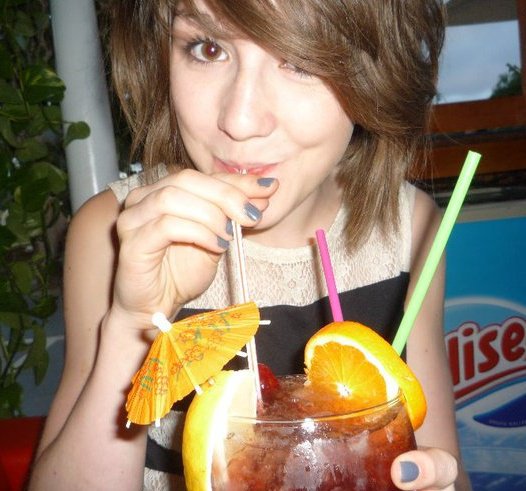
After writing my magazine article my artist 'Sara' is represented as an outgoing, down to earth teenager. I tried to make my model do poses which would reflect this.

Sunday 6 March 2011

Draft Contents #2

I will replace the images of me with others of different models, but as I haven't taken them yet I put the pictures of me in to give a rough idea on how my contents will look. I also am aware prior to giving in my final copy I need to exactly allign all the boxes, images and text.

Draft cover #2

My second draft cover, my only worry would be if it doesn't match the contents and double page spreads.

Draft Double Page Spread #2

I have decided to do two double page spreads taking strong influence from the March 2009 issue of Elle magazine.

Draft Double Page Spread #2


Changes I have made to my double page spread after receiving feedback.

Tuesday 1 March 2011

Draft Evaluation

After my conversation with Mr Smith I have decided to radically change my magazine in several ways.
I am going to take strong inspiration from the March 2009 issue of Elle.
By doing this I am going to change my colour pallette, to predominantly black and white; with a rasberry red on the cover to make 'Sara' stand out more. I decided to change the word 'pop revolution' to 'pop sensation' as I feel this suits the images and personality I am trying to portray coming from Sara.
I will still use the 'messy' writing on the background on the cover as we agreed that worked well, but have it in a grey rather than the darker purple so the 'Sara' is more obvious and stands out more and draws more emphasis to the image of Sara on the cover.
On the contents and double page spread I will try and keep my colour scheme monochromatic with small hints of the red used on the cover,as I have strong influences from black and white images.
I also will make sure that Sara's make-up blends in with the rest of her body, as it took a lot of effort to edit her face to be the right colour,she looked very washed out.
In conclusion to the images of Sara looking too washed out I have decided to retake the photos of her for my magazine, as now I am certain of what I am doing I can be sure to make them look more professional.