Tuesday 21 December 2010

Audience Profile

Firstly I decided to ask my friend Sara about her preferences, as she is a good friend I can provide more information.
Sara Zanjani (aged 16) is a student living in Leicester. She studies Media, English Language, History and Science. Among her favorite artists are Pixie Lott, Cheryl Cole, Girls Aloud, Rihanna, Katy Perry, Nicole Scherzinger, Take That, Miley Cyrus, The Black Eyed Peas, Ciara, Justin Timberlake, Timbaland, Enrique Iglesias, Mumford and Sons and The Saturdays. As you can see, a large proportion of Sara's music diet is mainstream pop. Sara dislikes heavy rock/metal as she finds it sounds like 'noise', hardcore dance music as it lacks a tune and serious rap music as she doesn't find it easy to listen to someone who sounds angry. This is extremely helpful as this is the kind of music taste I would like my audience to have.
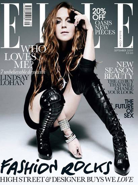
In her spare time Sara likes to do gymnastics, socialise with her friends and boyfriend, read magazines, listen to music, go to music festivals (She attended Summer Sundae in 2010, and is attending Glastonbury 2011) and go out into town. Whilst socialising with friends she would usually consume alcohol and play games such as 'lips' on the xbox, which features a majority of mainstream music in which you can karaoke to. Her favorite shop is River Island as she feels that it is contemporary and up to date with trends, which, again is ideal as judging by the planned style of my magazine it will reflect fashion magazines. Sara likes to read Elle, Vogue, Glamour and Q Magazines, all of which are contemporary and could be related to the style I aim to go for.
Her favorite films are the Harry Potter's and RomComs such as the Bridget Jones' and Love Actually. Sara also likes comedies such as Superbad, The Ugly Truth, Stepbrothers, Elf and Get Him to the Greek. Evidently she doesn't have a particular preference when it comes to films yet likes to delve in a lot of genre's, which is like Pop music as all pop music can fall into subcategories.

I then asked another of my friends Will Campbell (aged 17) on his pastimes/ preferences. I felt it was important to ask a male member of my target audience as they will have a different perspective.
Will is a 17 year old student studying Psychology, Maths, Physics and Biology. He aspires to have a successful job in the future in one of these area's, yet is unsure on which. Will tries hard and likes to achieve, yet he also enjoys a lot of activities out of school. Will's main hobby is rollerskating, as he films/edits videos of him and his friends skating at local skate parks. He has a lot of input to his video's and chooses the music involved.
He usually employs his music taste in these video's, as he enjoys to listen to fast remixes of Rihanna, Adele, Example, Katy Perry - "anything with catchy lyrics and a good tune to it, I'll listen to it. I listen to the original versions of songs when I'm chilling, then while I'm skating I listen to remixes of the songs". Will, alike Sara, Doesn't like heavy rock/death metal and heavy rap. Otherwise he enjoys listening to a broad variety of music, mainly top40 music.
Wills hobbies include Skating, Editing, Filming, 'Chillaxing' and socialising, such as partying and meeting up with his friends. "While I'm at parties I use the software on my laptop to mix different songs to really create a good atmosphere" He says after Christmas he will start properly DJ'ing with a new kit he is getting. Will's other interests include going to music festivals such as NASS, Reading and Leeds and Oxygen.

I also asked Paige, who is a 22 year old student at Leeds Metropolitan University studying Advertising and Marketing Management. She says music is important to her as it helps her to relax and concentrate whilst studying. She would describe her wardrobe being predominantly from Topshop, being a contemporary clothes store she feels as if she is up to trend and has a keen interest in fashion.
Working in advertising, Paige finds whilst producing an advert it is more successful to use a completely new soundtrack, or use one that is currently in the charts. "The reason the Morrison's advert sticks in your head is because they use 'Shine-Take That' which is a popular contemporary song"- so she has good knowledge of what is in the top40, and finds that she liked to listen to music of that genre most of the time. Like Sara she enjoys reading fashion magazines, and says she spends hours browsing for different unique looks on the Internet - yet nearly always ends up buying her clothes from Topshop. She would say her musical idol is Beyonce, who arguably could fall into the genre of Pop.

I found by asking members of my target audience a greater insight on how the style of music they are interested in affects their fashion taste, therefore the fashion magazines they read; which will relate the style I will try and involve in my magazine.

Target Audience


Monday 20 December 2010

Personal Influences

I have a large interest in layering photographs and creating collages on my walls at home. Although this is not professional inspiration I feel that it contributes to the style I plan to achieve for my magazine.


These are pictures of my walls at home. I really like black and white images, as I find that paired with a colour ( in my case my bedroom is black/white and raspberry pink) it looks really effective. I hope to use this sort of colour scheme throughout my magazine, or rather than just one colour, several tones of different colours. I think that it is important that I have inspiration that is personal to me, as it means I have my own interests involved which makes it more enjoyable for me to work on and I have previous knowledge on what I prefer, rather than starting from scratch.

Font Samples

When looking for a font to use for my Masthead, coverline's and titles on my cover I used dafont.
Firstly i decided to look at the fonts for my Masthead (left). I want something that was quite simple, yet reflected my magazines style and the name 'Studio' - so it had to match that word. The first fonts I looked at were basic fonts, which I found looked most clean cut, classy and professional. I found that the really bold font's didn't suit my magazine style, and that the handwritten ones looked a bit tacky as a masthead - and may not reflect that my magazine is a music magazine, that it could be an art or design magazine.
After looking through a numerous amount of fonts on dafont, i decided that the one at the top on the left (Edition) would be suitable for the masthead of my magazine.
I chose this because it isn't over complicated, and looks professional. I plan to use a 'brush stroke' type font in the style of the Blake Lively edition of Esquire, which I mentioned in a previous blog post, for the name of my model (Sara Zanjani) across the background; to create the effect she's physically standing in front of writing on a backdrop, rather than it have been edited in at a later stage on photoshop.
I also think it will contrast nicely with the brush stroke style (right) as the masthead will be easily recognisable in a bold colour, and I will use a lighter colour for Sara's name in the brush font.
After looking at the font's on the right (to use for Sara's name on the cover and for her double page spread) I decided that a larger, bolder font would work better. From looking at these samples I would chose the second one from the top (right). My inspiration for this would be the Kate Moss edition of Pop magazine, where there is text written across the page in this style, I thought it looked unique but again, proffesional and thought about, it also reflected the photo shoot and relates to current trends - which I will be dressing Sara in.
I found that after looking at these two types of font's I will need a third, clearer font to write the coverlines in, I have yet to decide between a handwritten font or a basic serif font. I will make my decision after doing market research and Sara's photoshoot; to see which suits the style of the magazine best.

Example Cover's moodboard - further inspiration

I decided to look further into the magazine cover's of Esquire, Pop, Elle and Vogue as they are the most influential to my magazine. I also think that the cover of a magazine has to reflect the overall style, so I used these covers to take inspiration for my own. The style of magazine I am going for is a cross between the Blake Lively edition of Esquire, and a high contrast cover such as Gwen Stefani on the cover of V or Drew Barrymore on the cover of Pop.
Another influence I would like to take is the writing that runs behind the models of Esquire, rather than on or over. I like that as it looks as if the Model is standing in front of a backdrop with all the writing on. I think this looks different yet would draw the audience in as I think it is fun to look at and easy to read.
I also liked the font on the Kate Moss cover of Pop, the brush strokes contrasted with the basic title to make the magazine look very versatile, I plan to use my models name in the background (in the style of Esquire) with a similar font to that on the cover of the Kate Moss edition of Pop.


Sunday 19 December 2010

Magazine Name Mind Map


The magazine names I concluded on was between Studio and Cassette, as I feel both are versatile yet identifiable as a music magazine, particularly Pop; as Cassettes were mainly distributed containing popular music ( not all necessarily being in the genre of 'pop' music - but all pop music falls into sub-genres). And Studio - that all pop music is recorded in a studio, and it will match with the contemporary fashionable style of my magazine. I don't think it restrict my audience as Cassette/Studio isn't too mature/childish and doesn't have any connotations that aren't to do with music. My only issue with Cassette is that people could relate it to vintage/retro music; yet this will be proven wrong as the style of my magazine will be very contemporary - with strong influences from high fashion magazines. The issue I have with Studio is that it isn't strongly related to a music magazine, especially the pop genre.
After asking ten people in my target audience of the choice between 'Casette' or 'Studio, seven said that Studio sounds more professional and closely relatable to Pop music, whereas they found Casette would represent vintage/retro music.
Therefore, Studio is my chosen magazine name.

Moodboard


My moodboard is an exploration of general ideas, rather than solid decisions of what I plan to do. I haven't focused on anything in a lot of detail as I want to get a general perspective of the style of magazine. By doing this it has helped me to decide further of the type of magazine I will do.
I would like to do a mainstream pop magazine using a lot of inspiration from high fashion magazines to create the style. I have yet to decide the feature colour of my cover but I am certain I will use grayscale and high contrast on the main image. Again, I have yet to decide the fonts and coverlines as I have only being exploring my initial ideas for my magazine.

Thursday 16 December 2010

Double Page Spread Analysis'

 Vibe Magazine
The double page is split into thirds horizontally, with the top third being 7 different images of Solange Knowles dancing across the back. The colours use are bright and contrasting, the blue of her cardigan is used in the text to make the overall appearance seem more continual. The font colour matches the gray scale of her smaller images, which draws attention to her bright outfit. The lines underneath the smaller images give a clear divide of the pages,
and make it easier to read and makes the page look less busy and cluttered. The use of the blue ' Solange Knowles' will indicate to the reader who it is, and most of the target audience would know that she is related to R&B superstar Beyonce Knowles, this would attract Beyonce as well as Solange fans. The fact the smaller pictures are of her standing up straight reflects the columns being very straight and formal. Judging by the pictures in the background she is being represented as Trevor Millum's 'Carfee' model. The ratio from pictures to writing is probably 60/40, as a reader would be too overwhelmed by a full page of writing and no pictures and this would put them off reading it. I like the bright colours used with the grey as I felt that it doesn't look too overwhelming, but quite relaxed with a twist. I like the idea of the 7 different images of her dancing across the background, as it gives the page more depth and more images to look at.
 Q Magazine
The colours used in this double page spread are the staple black, white and red. After looking at the cover, contents and now this page it is clearly established that these three colours are the three that they like to use, this creates their statement 'house style'. The page is split into two sections horizontally, the top two thirds are pictures of Brandon and the bottom third writing. The two pictures have been cleverly picked out to match with the colour scheme, the black furniture and red wallpaper reflects the black and red, and the white of his skin tone and the sound system brings out the three colour scheme in the pictures, these pictures reflect Brandon's music style. The writing cleverly uses all three colours; black and white for the majority of the writing then red for a quote. The page is set out quite simplistically, and I like that it doesn't look cluttered.
 Billboard Magazine
Compared to the previous  two articles this uses a lot more text and less images, yet the image at the top of the page is very eye catching (Rihanna is sitting on a turret of a pink tank, which could be interpreted as something else) This would draw the reader in and encourage them to read the whole article. The colour theme again uses grey which I think softens the appearance, rather than using directly contrasting colours such as black and white. The text is marginally broken up by inserting two pictures of Rihanna in the bottom right side of the right page. I like the use of the 'Pon De Airplay' which is a play on words of one of her songs, which gives readers a chart of her top 20 songs. The ideas I like from this are the smaller images amongst the text, however I do not like the huge amount of text as I feel it'd be discouraging to read when presented with this amount of information.
NME Magazine
Similarly to Q the three staple colours are used. The colour theme is carried throughout with Florence's hair being the same colour as the flag, and the rest being grey/white/black. I like the use of the font behind Florence, relating to her song ' You got the love', the title implies she has been to, or toured America. I also like how there isn't a huge amount of text so it isn't off putting to read, and it fits in line with the flag. It would be interpreted that Florence is what Marjorie Ferguson would describe as 'invitational', possibly attracting a male audience as well as people who appreciate her music. The inspiration I would use would be the text behind the main image, as I think it links the page together well.

Conclusion;
I found that I preferred the colours used in Vibe magazine and Billboard compared to Q and NME - which were quite similar, Q possibly more formal. After looking at these double page spreads I decided I want to use more than one image on my double page spread, but have one main image and a few smaller ones. I would like to use inspiration from fashion magazines such as Elle, Vogue and Pop mixed with typical traits from a music magazine. I thought that the text behind the image in the NME double page spread worked really well and linked the image and text together so I will be considerate of this when I am planning my double page spread. I found that Billboard and Vibe were most relevant to the genre (mainstream pop) of music that I have decided to do.

Contents Analysis'

Vibe Magazine
The contents text is fitted around Ciara's picture, as is the colour scheme. The outline of the 'V' keeps the idea of the Vibe theme, Ciara's legs also being in a V shape keeps the theme running. The magazine continues to be quite 'out there' by putting the word Contents on three different lines. The white block writing for the word Contents stands out as it is the biggest, and only white writing on the page. The subheadings read 'Features' and 'Fashion', using alliteration keeps an organised feel to the contents page. The subtitles font is also quite neat and classy, which would how readers would interpret Ciara, as the contents page is based around her, by using Ciara's image it shows the reader there will be a further feature about her, which is the first one under the 'Features' column. I like the idea of the contents page being based around a model as it keeps a theme running throughout, as Ciara was on the cover of Vibe in October 2008 - this issue. The colours used are quite neutral and relaxed, which again represents Ciara's music.The layout of this page is formal, and easy to find information, rather than a busy page which could have un necessary information and confuse the reader. This page looks simple, as less than 50% is made up of text.


Q Magazine
This page is set out in boxes, which gives it an organised feel and contains all of the information neccisary in a non cluttered way. The colours used are the staple colours used in a music magazine, and are the same as the front cover. The columns are aligned to the left which is where the eye would be drawn to, as the main features are underneath the Q logo and the title 'contents' , which is the biggest and most contrasting piece of information on the page. The two titles which would then draw the eye are the 'Features' and 'Every Month' columns, the features column would interest a regular buyer more as the articles will be new and different, compared to what they are used to reading every month. The picture of the courteeners used is following the black/white/red colour scheme, by the members of the band dressed in monochromatic clothes. The lead singer is in white, standing out from the others implies his importance. There is a text box on the picture saying the page number and 'The Courteeners' which immediately tells the readers who they are. The review box is also easily identifiable at the bottom right hand of the page, giving more subheadings of the different reviews available in this issue. This page looks quite busy compared to Vibe magazine as their is a lot of text, I think it is too much information and makes the page look cluttered. I like the idea of putting more than one picture on the contents page as it is more aesthetically pleasing than just words. I don't want to use staple red/white/black colours as a theme throughout my magazine as I want mine to stand out.
NME Magazine (picture quality is bad due to poor lighting)
A instantly recognisable similarity between Q magazine and NME is the three colours used; red, black and white. This contents page uses these colours more strictly, as the images chosen are using predominantly black and white. Colour wise the page seems to be vertically split in half , the left half has more red and the right half has more black. The only other colour used is the yellow 'subscribe today' text at the bottom, to advertise to readers the subscription service they offer. Again, this contents page is more similar to Q's content page than dissimilar, the layout is structured to look tessellating, which would give a more organised feel to the contents page. I wouldn't agree that this works as I think the page is too busy and there is too much text and information to look through. There are more subtitles than in Q magazine, 'News' 'Radar' 'Reviews' 'Live!' 'Features' which I think adds to a busy page. Although the band index is a good idea it makes the page look cluttered and that it has an overload of information. Judging this layout I would say that this magazine is aimed at 15-35 year olds, as there aren't any images or colours to attract younger people, and the layout is too busy for older people.

Billboard Magazine
I decided to analyse this magazine as the bright colours and cleaner style is the type I'd like to use for my magazine. This page is separated into two sections vertically,therefore using two colour schemes. The left hand section is a music chart, giving the readers information on who is at number 1 etc, this continues the theme of it being a contemporary mainstream pop magazine. I think that doing it in a more ' clean cut ' style this chart is a good idea, and adds more relevant information to this page, rather than the band index on the contents of NME which makes the page look cluttered. The two thirds on the centre and right side of the page use more contrasting colours; black, white and blue. The outfits of the artists are matching this colour scheme which gives the overall look more classy, the artist in the centre on the right hand side's outfit contrasts with the background, which makes it the divide between background/picture clearer and makes the page easier to look at. The writing is quite small and no text apart from 'Contents' and 'No.1' stands out, this encourages the reader to read through the articles to find out what is in this issue. I like the idea of using bright colours with grey/black/white to create a certain theme on the page. I also like the use of the inserted pictures with page numbers on, as this gives the reader an image to base their opinion on what the article is going to be like. I also like how nothing is overlapping in this contents page, as it makes it easier to identify certain information.

Tuesday 14 December 2010

Magazine Cover Analysis'

Q Magazine
3 colour palette;
Red, grey/white and black are used. These colours are closely associated with Rock and are popular amongst music magazines. These colours strongly contrast with each other, black and white alone would be monochromatic so red is used to stand out and be eye-catching. 

Banner;
The banner doesn't take your eye away from the masthead, yet stands out as directly opposite colours used. 'The UK's biggest music magazine' isn't too complicated so wouldn't need much effort for the reader to read. 

Masthead;
The largest letter on the page, in the top third which is where the eye gets drawn to first. A connotation of Q could be that it is an unusual magazine, as the letter 'q' isn't often used. 

Central Image;
Cheryl Cole is represented in a 'rock' style, rather than her usual 'pop' style. She uses Marjorie Ferguson's romantic or sexual expression, or possibly Trevor Millums seductive expression, indicating to men that she is available - this would encourage a male audience to buy the magazine. 
Rain is also used again, to the semi-literate audience, to advertise her newest album 'Messy Little Raindrops'. The words '3 words' were used also which relates to Cheryl's single; ' 3 words', this would encourage Cheryl Cole fans who don't usually buy Q to purchase the magazine.

                                                                      NME Magazine

NME Magazine;
Top Third:
Reading and Leeds festival are known to be rock festivals, which would give an immediate invitation to the target audience to look further. Apart from the masthead the 'preview special' contrasting with the black background would immediately draw the eye, as it would stand above others on the newsstand.
The colours used in the top third are all equally contrasting, comparing to the second/third third which are slightly more layed back colours. The names of the bands are directed at a variety of audiences; Metallica is the older generations, Foals are more indie whereas Slipknot are closer to heavy rock.

Bottom 2 thirds;
The font ' The Killers ' is similar to The Killers' logo, making it more recognisable to fans. Their front man Brandon Flowers, is made identifiable with the subtitle 'Can Brandon find the plot in time for Reading and Leeds?', using his first name makes the magazine more personal and the readers will feel that it's easier to relate to him. The smaller quote ' I'm having a personality crisis right now' is reflected in the pictures having three different expressions, and that he is possibly torn between choosing which one, as the effect on the paper is torn.

The cover has a festival theme to it, as it mentions V Festival and Reading and Leeds festival, so if it was released in the summer it would be more appealing as it is festival season.
                                                                  Vibe Magazine


The colours used in this magazine contrast with those of NME and Q, which were quite similar. The colours are bound to be different and attract a different audience as this is a completely different genre of music. The masthead is the only piece of text on the cover which is gold, so that would stand out from any other image/text placed on top of it. The next most important text is coloured red, which is the 'special collectors edition' ' 150th issue' ' Mary J Blige' and ' Kisses,Clothes', there are many artists named in grey which indicate they are important, yet not as important as the feature article on Mary J Blige.
The grey(silver) and gold could also reflect that r&b artists stereotypically wear a lot of silver/gold jewellery.
The central image of Mary J Blige is the centre piece, as the text is fitted around her; this implies she is the most important and there will be more information included about her.

I decided to chose three different genre's of music magazine to analyse as I wanted to experiment with different styles, I found that the R&B artist was more aesthetically pleasing, and that I preferred Cheryl Cole image as it was very stylised and matched the style of the magazine. The three colour palette colour scheme was more effective, as it didn't make the magazine look too cheap or 'busy'. On the subject of colour I found that the yellow on the NME magazine looked at bit tacky, and wouldn't encourage my target audience (Similar age group to me 15-18 years old) to buy the magazine.
I think that using one image, rather than 3 on NME, makes it simpler and easier to look at, and again doesn't make the front page look too 'busy'.
The dress of my model must reflect the genre; if Mary J Blige was wearing skinny jeans and vans it wouldn't reflect the genre closely.
Whilst looking at these covers I have decided to do a mainstream pop magazine, taking inspiration from Vibe, as I didn't really take to the black and red, as I find it looks too 'rocky'.
After I evaluated these covers I then found 'Billboard' magazine, which represents what kind of style/colours I plan  to use for my magazine. I would like to mix this style of magazine with a more classy style of a fashion magazine such as Elle, Pop or Vogue.

I prefer these covers as they are more contemporary and eye catching, I also like them as they are different to typical music magzines; they don't contain the basic red/white/black colour pallete which I think doesn't suit the type of magazine I have decided to do. Billboard have also used contemporary female artists, who look like they could be models, rather than someone (e.g) Hayley Williams from Paramore who looks like a rmusic artist. I think that Billboard magazine is more relatable to the type of music magazine I want to do.

Thursday 9 December 2010

Magazine Evaluation


After finishing the front cover and the contents page, the things I thought went well were the planning that I had done, which made the production stage smoother and easier to do, as I didn't have to think of different ideas so it wasn't a struggle.
The strengths I had throughout this project was that I knew what kind of photos I wanted, and the colour pallette I was going to use. As me and Becca were in a pair for photo taking, another strength was that we didn't mess around whilst taking photos so that gave us more time to get on photoshop and start editing. I thought that I had a basic idea on how to use photoshop as I'd used it in art, so that was better than starting from scratch.
Another strength I found that I had was after Mr Smith tought me how to use the magnetic lassoo, it was a lot easier to cut out the images of Becca and it looked really neat. I thought everything went well but one of the weaknesses was that I didn't have any immediate ideas when I was planning so that used up a lesson, but eventually I had more ideas and then my initial ideas came together.
A flaw in the making of this was that I was ill for the final lesson of doing our contents/front cover, so that is why the work is in late because I dont have photoshop at home.
Overall I reckon the whole task went quite well and nothing went drastically wrong :)

Magazine Production

For the production of my magazine I had to firstly get the photos I needed of Becca, so firstly we had to find somewhere to take the photos ( I was Becca's model) which wasn't hard because we needed a white background so we took them outside and in the new canteen, Becca was doing a maths magazine called 'geek' hence why i was in the glasses.I took about ten shots of Becca, vice versa, which didn't take long as we took around ten shots of each other before we decided we had the variety we needed.

I then uploaded the photos onto a computer in the classroom, then decided which one I wanted for my cover and started to edit it on photoshop. The photo that I decided to use for my cover was the one below of Becca looking like she was doing a mime, you wouldn't look at it and automatically think 'drama' but if the cover gave it all away you wouldnt want to read more. I also chose it because the specifcation was that we had to have a mid shot of somebody for our front cover and this was one of the only mid shots I got, I decided to use one of the pictures of Becca jumping for my contents page.

I started by cutting around Becca using the lasso tool, which took about a billion years because the computers in there are very slow. I wasn't pleased with my final cut out of Becca because it looked a bit sketchy and a bit of her head was missing where I'd gone wrong, which I wasn't really pleased with because nobody wants to buy a magazine with the model on the front who has a bit of her head missing. Then Mr Smith showed me the magnetic lasso tool which was a lot easier because it found the outline of Becca and it made it look a lot smoother.

I then had to choose my font for the title. I chose a font that I cant remember the name of but it looks a lot like this one, because it is dramatic and that is the theme of the  magazine. The colour palette I chose of the text for the cover was the same blue of the cardigan Becca was wearing. I thought it was important to chose the same blue as it made the magazine cover have a theme, rather than me chosing three different colours as well as becca being in blue, it could have looked a bit messy and not actually thought into that much, white ( as i'd given the cover a black background ) and a bright peach colour. I achieved the same blue as Becca's cardigan by Mr Smith showing me how to use the pipette tool on photoshop. I used contrasting colours ( white on the black, blue with peach, white with peach) next to each other so it would be easier for the reader to see what I wanted to stand out. I found it easy working out how to use the layers and how to move things around so that sped things up a bit, I had some basic idea on how to use photoshop from doing art at gcse, but that was more editing photos and scanning things in so not really the same sort of area, I think i did okay for a first attempt at making a magazine cover though :)

Magazine Pre Production

The task we were given was to design our own school magazine cover and contents page, the magazine's target audience is people at our school (age 14-18). In preparation for this task we had to bring a magazine to the lesson, and look at the way the front page and contents page were set out to give us some idea on the layouts of magazines. For inspiration I went on sites such as Vogue, Elle, Grazia and NME. The covers that caught my attention the most were these ones below from Vogue. I like them because they use strong colours, eye catching pictures on the front and I am interested in what they are wearing. My favorite one is the one of Agyness Deyn ( middle row on the left ) because of the colour palette and the word 'dazzle' caught my attention.


Obviously I wont have a model on the front of my school magazine because its a school magazine and thats not going to get the attention from all of my target audience and I don't have the money. The ideas i did get from these covers was the bright colours, especially the contrasting colours of the cover on the first row on the left because they aren't two colours you'd put together but they work. They catch people's eyes and make them want to read on, to I kept that in mind. I then had to decide if I was going to do a general magazine or focus on a specific subject, I couldn't think of a name so i decided to choose drama because its a subject I do and you can do more with it, as I reckon a drama magazine about shows and actors sounds better and would interest my target market more than an English magazine about books and writing. I decided to call my magazine 'DramaRama' because it says what subject it is and you'd know straight away if you are interested in it. It doesn't sound deadly serious but I know that at our age, as a school magazine you dont want something deadly serious and a bit heavy to read. I know that not everybody in the school reads the school magazine, I for example haven't read our school magazine so by targeting a specific subject the people that are likely to read this are people who are interested in drama. Drama isn't a subject that is entirely serious, whereas maths and science is. In my opinion you can have fun in Drama, and I wanted my magazine to portray that. This was the mock up of what I basically wanted my magazine to look like (picture above). I already knew I was going to use Becca as my model at this point so that was one less decision I had to make during the production, because the more decisions I made before I wouldn't have to make in the production which would make it smoother and easier.


Tuesday 7 December 2010

These aren't all music magasines, yet I can get inspiration from the style.